Plans and Progress
Introduction
Since the start of the 2020 pandemic, countries across the world have seen rising costs of food and goods. In fact, in Canada, the average household will be paying 5% more for their groceries by December, and it is possible that this will rise even further by 2022 (Charlebois, 2021). Most people have not been deeply aware of the supply chain and how fragile that system can be. Food producers, in particular, have dealt with things such as “shortages, bottlenecks, transportation, weather and labour woes” (Reiley & Fowers, 2021). Not only has the pandemic made inflation worse, but the existing poverty line has widened. As of 2020, Australia had the 16th highest poverty rate out of 34 wealthiest OECD countries (Poverty & Inequality, n.d.). It has been found in the 2020 report ‘Poverty in Australia 2020’ that “one in eight adults and more than one in six children are living in poverty” (Poverty & Inequality, n.d. para.7.). The project aims to provide a useful tool to empower people and give them easier access to cheaper products. It will aim to ease the economic burden of the current inflation and to expand the wealth gap felt across the world , as well as being a useful tool for everyday consumers to save and cut costs when shopping.
Our initial project plan in Assessment 2 consisted of an overview of our application idea; we researched the statistics in e-commerce trends to highlight how drastically online shopping was taking business away from physical stores. We provided a solution to make the physical shopping experience as convenient and cost-effective as online shopping, blending technology and the act of buying in person. Next, we went into tools that we would be using to help build and develop the project idea. Additionally, we outlined the front-end and back-end tools as well as discussed our group's expertise using said tools. We were then able to decide what tangible artifacts we were able to work towards during the project timeline during the semester. We were also able to have a better idea of what would be out of scope and what would be in scope for the entire project during this semester.
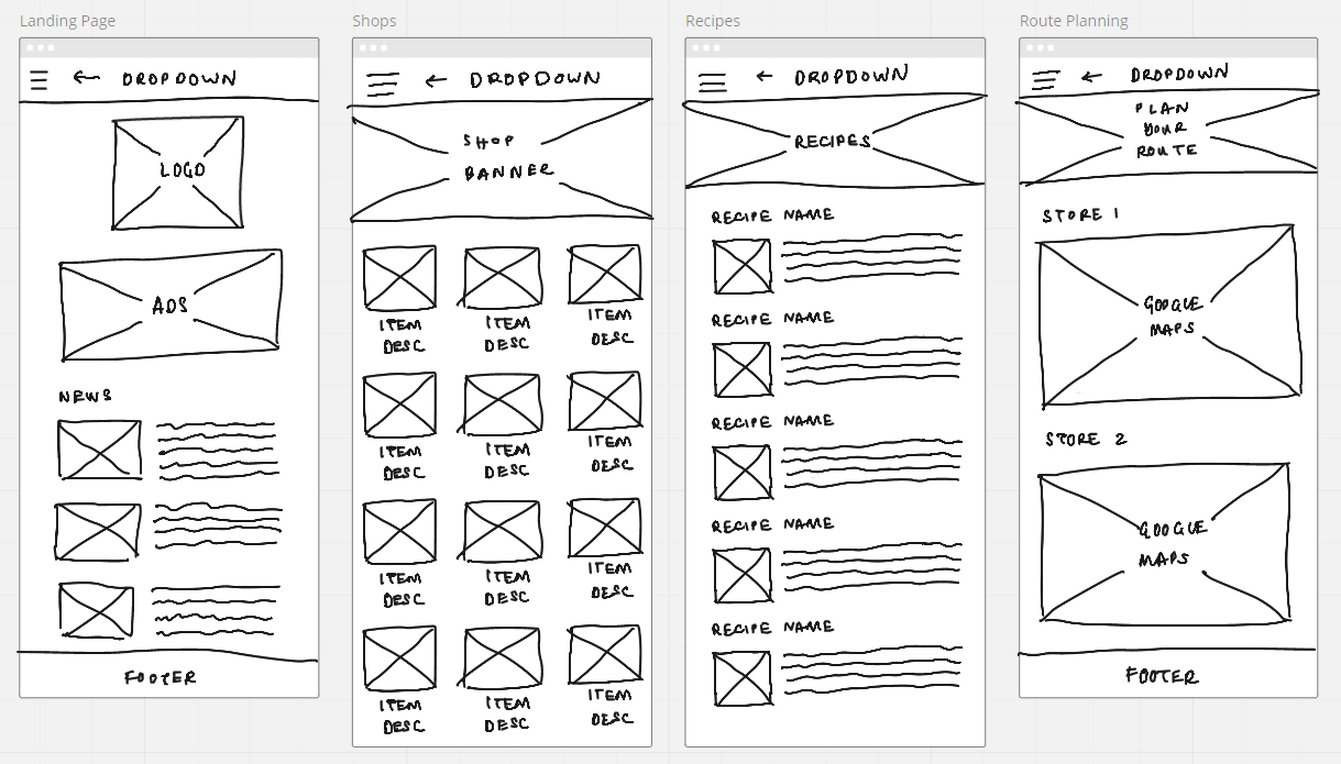
We made mock-ups of layouts in design meetings to give us a clear idea of how to proceed and what would be needed when building our website for the application.
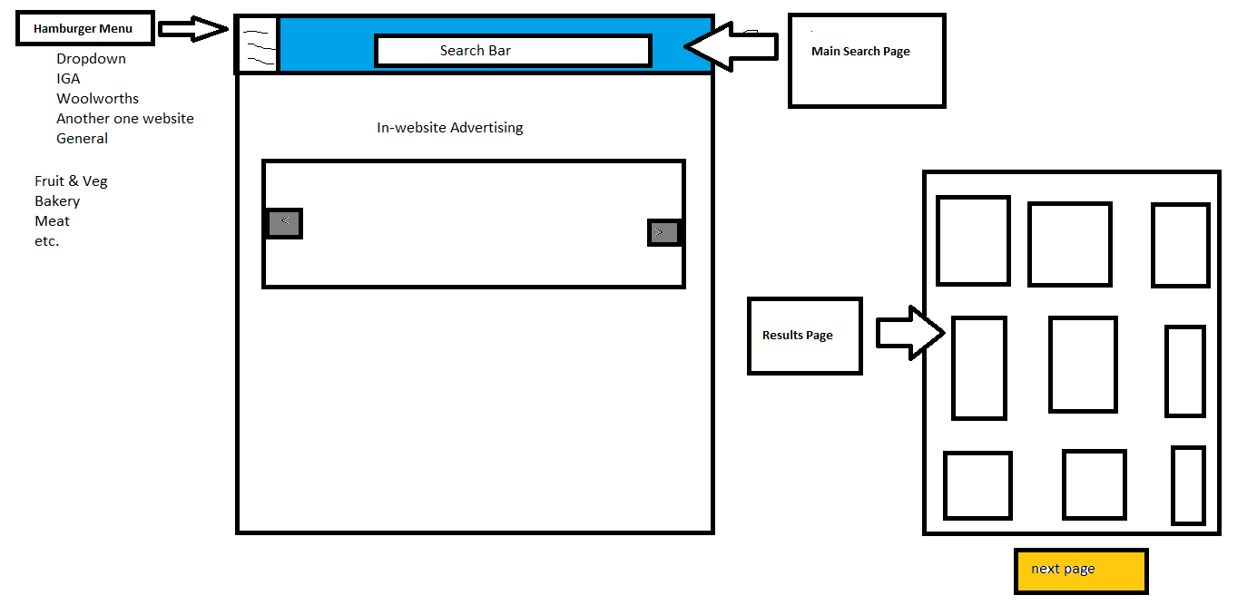
Figure.1, Pictured above, is a potential layout that we have decided on for the application website.
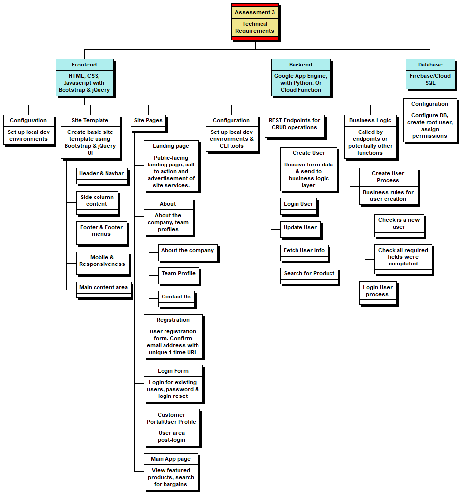
Figure 2, Pictured above, is the WBS Chart we used in the initial planning stage of the project.
We used the WBS chart pro to create our product backlog for the project and to create a list of desired work on the project. If we were to follow the SCRUM methodology, we would then create a sprint backlog which includes short statements of what work is required during the sprint. To set up our local development environments, we used GitHub as well as VSCode, Atom and Note++. Some dead ends that we ran into with this WBS chart plan were that we realised that some of the Database aspects of the plan were outside of our group's expertise, as well as a lack of knowledge in how to fully integrate Back-End and Front-End and connect that to a database. We decided instead to work towards tangible artefacts and components of functioning code for the project idea as well as wireframes, iframe embedding and detailed planning.\
The chart remains an important part of our overall aims and goals to get the project to completion if this project were to be handed over to another group to complete the development of this project.
As a group, we decided to try to adopt an Agile methodology of development for this project, where we would focus on the highest priority tasks. We tried to get a clear picture of the scope of the project that we would be able to achieve in the time given and tried to get as much functionality within our skill and time constraints. Another reason we chose to adopt the Agile methodology was that it is the quickest way to deliver a complete piece of software (Altvater, 2017). When we felt as though our focus was getting off track, we reminded each other to apply the Keep It Simple or (KIS) principle (Alvater, 2017) to refocus our efforts and get more work developed.
Dead-ends
An area where we ran into dead-ends was the idea of developing a desktop application. We realised that it was outside of the scope of this project, and our efforts would be better on getting the website for the project up and running as well as detailed mock-ups and wireframes.
As the project commenced, we were not entirely sure how much of the project we would be able to develop and make fully functional. Throughout this project timeline, we were able to make changes to the project plan as we went along. Initially, we had planned to build a complete front-end and back-end that would be connected to each other, but part way through, we realised that there were some difficulties in connecting these two systems. Our solution to this was to create the front-end as well as add detailed wireframes, iframe and mock-ups of what we envisaged the front-end to look like and at the same time, we created some of the back-end code. There is currently no SQL database, but there is a database in the form of text files that were created by web scrapers.
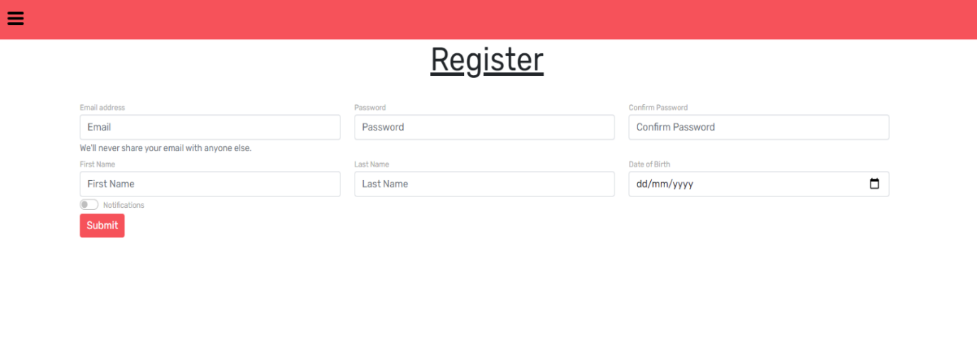
The example below is the registration form we created for onboarding users, as well as the mock back-end that we created for this part of the website
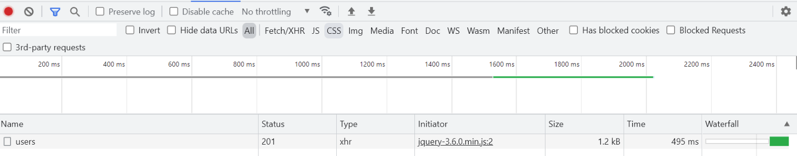
The above picture is an example of POSTING form data to an HTTP end point. If this were a real back-end, it would be part of a back-end API that would send form data to a database to store in a table and then return the ID of the new user record.
In a real back-end, the ID would be used to immediately redirect the user to their new profile page.
Status 201 in the picture above indicates success, and if we were to see Status 400 or Status 500, this would indicate an error has occurred.
At this stage of the project, as we go into the final week before submitting assessment 3, we have been able to get most of the project idea website fully functioning using tools such JavaScript, Python, Python requests and DateTime modules, Selenium, Google Maps API as well as JSON and JQuery.
We have used an iframe to embed into the assessment webpage to display the prototype that we created in a creative way. The border styles chosen for this iframe are aimed at resembling a mobile phone. The user can scroll and click through the prototype as though they are using it as a mobile application.
Link to Prototype Demo: Click Here
Our next stage of development for the application would be to start building the fully functional mobile application of the project idea using Native app development to create a cross-platform mobile app. We would also look at creating a database where we could store user data and the product information needed for the site in a relational database such as SQL.
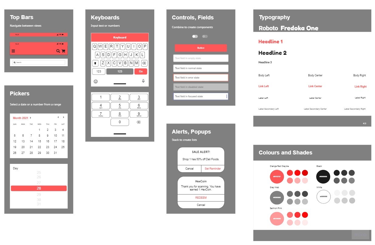
Mock-ups using Miro to show how we are going to develop and design the User Interface (UI). This helped visualise and form a better idea of what the team should work towards. We then were able to discuss in further detail what we wanted to add or keep or change in design meetings.
A style guide was created to create wireframes for our user story. This represents the ideal of what we would like to achieve and build for the project. When developing the style guide, we also researched colour psychology and marketing trends to help decide on fonts and colours that we would like to use for the development of our application. We used the colour red as it is associated with excitement, energy, and action (Ferreira, 2019). Not only is red an eye-catching colour, but we read that brands such as Coca Cola use the colour red because it increases people’s appetite. We used elements of grey shading, and we researched that the use of grey can be striking for headers, and it helps to give the application and webpage a clean and polished look (Ferreira, 2019). We also investigated the importance of choosing a font that can show the personality of our group's project idea, as well as being appealing from a marketing perspective. The modern font that we chose, ‘Roboto’ and ‘Fredoka One’, was hoped to show intelligence and distinctiveness and represent our hopes that this will be an application for the future (Pahwa, 2020).
When doing our initial planning, we decided to create a user story to explore all the features that we would need to include in our application development. Initially starting with a few basic headings such as, what the app does, how to register with the app and how to search with the app, we then expanded on each of those points until we found a level of detail that we were satisfied with.
User Stories
What the Budget Hub Application does exactly:-
As a user, I want to install the app to search for products in my area
- User searches for an app to assist them with shopping or is directed to the apps listing via some form of marketing.
- Android & iPhone versions are available in their app stores.
- The user clicks install on the app store page
-
Registers with app
- The user, on first opening the app, is presented with a registration screen
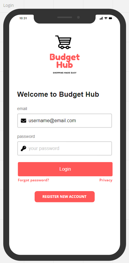
- The user is presented with a login screen that also has the option to register a new account. There is an email and password input field if you already have an account.
- If you do not already have an account, there is an option to register a new account.
- The password is stored in JavaScript as a hash, which was generated through a secure hash function, hence ensuring the ability to check the validity of your username and password whilst also making it impossible for a third party looking at the JavaScript to know your credentials. We did this for the application to have working log in functionality, even though we have not connected the front-end with the backend (due to the absence of a server). Currently, the functioning credentials are the email michalis001@outlook.com with the password michalis001
- There is a link to click under the login button if you have forgotten your password on the left-hand side, and there is a privacy link to click under the login button on the right-hand side.
-
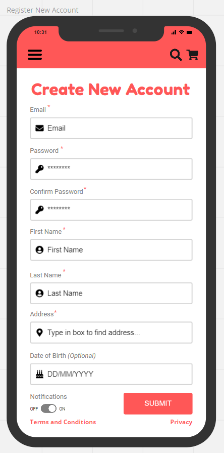
User can register a new account using the register now button from the login in screen.
- To start with users will be directed to fill out input fields in the Create New Account screen.
- This includes input fields of an email address, a password field as well as a confirm password field. This will be checked using a JavaScript function on the front end.
- The first password box will also check that users are not using illegal characters. This can be in the form of a pop-up message. This will be done with either html and or JavaScript functions.
- The bottom password box will need to match the top for added security. A message will appear if the passwords do not match. If the passwords do match the input field will turn red, and if they do match the input field will turn green.
- Users will then need to fill in their First Name and Last Name.
- Users will then need to fill in their Address, with a search function build in to assist with the correct address format. This will be done using Ajax calls within a JavaScript function to dynamically populate the field.
- Users will then need to fill in their date of birth.
- They will then have the option to turn notifications for the app on or off.
- They have the option to read Terms and Conditions via a link on the bottom left of the screen.
- They can also read a privacy statement regarding how their personal data will be used and stored on the bottom right-hand side of the screen.
- Users can then submit by clicking the submit button on the bottom right-hand side of the screen.
- Once users have submitted a back-end token will be assigned to that user's email address. Users will then be asked to go to the email address provided to verify the account.
- After verification, the app automatically logs users in.
-
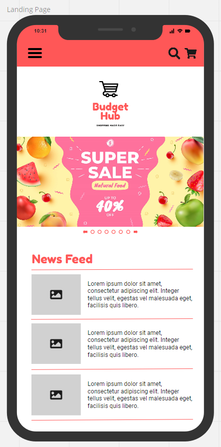
Landing Page where the User can see the latest deals
- The landing page is the first page users see when opening the app.
- They will be able to see a large slider that will be updated with the latest sales and offers.
- Below it is a news feed which includes deals from stores in the area. As well as featured offers from stores.
- There is a drop-down hamburger menu on the left which allows the user access to the categories within the application.
- On the right-hand side users have the option to search for items directly from the landing page.
- Next to the search icon, there is the shopping cart icon.
- When items are added to the shopping cart a small number will appear using JavaScript and jQuery.
-
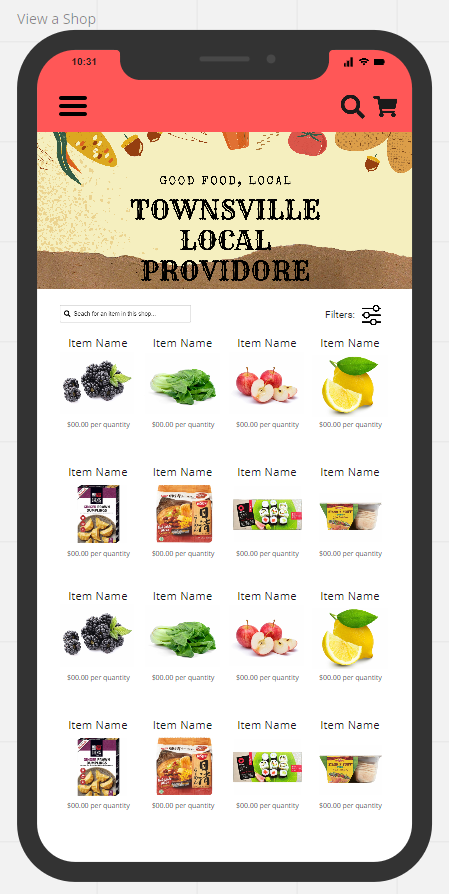
View a Specific Shop Page where the User can see and select specific products
- Sixteen icons with the Items displayed per page are displayed with the Item Name above and the amount per quantity below, to update it regularly it will be web scrapped against the shop webpage.
- A search field on the left-hand top corner allows you to search for specific items in a specific shop.
- The right side of the screen has a filter icon, to narrow your search of items in the store.
- The top of the page has a shop banner specific to each shop.
-
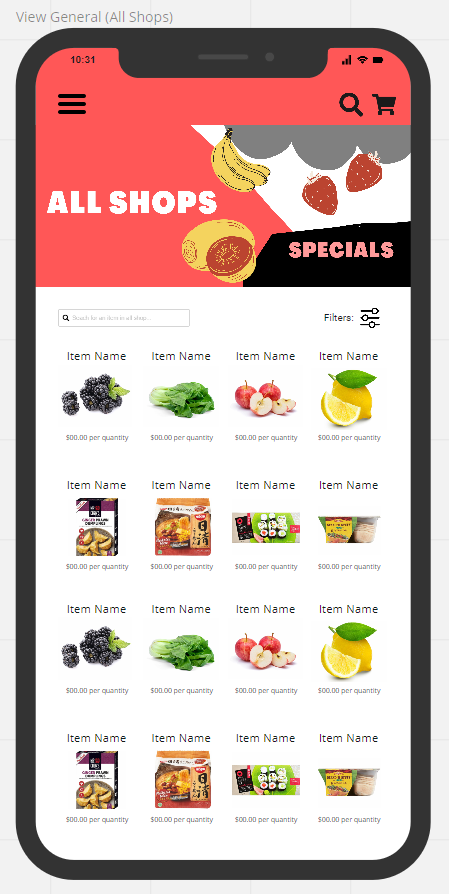
General Shopping Section once you have defined location
- Once your location is defined from your user registration form you will be directed to the general section which will populate items from the shops near you.
- It will populate items from roughly 20km from your location.
- Once you click on the item, the item will have a shop banner stating which shop the item is from.
- When you then add that item to the cart it adds it to the cart and then brings you back to the page you were on before clicking the item.
-
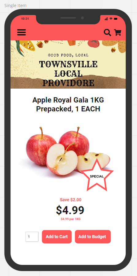
Single Item Section
- The single item will display the shop banner at the top, well as the hamburger menu on the top left. The search function on the top right as well as the cart icon on the top right of the screen.
- The Item image will be displayed as well as showing if there are any special deals on the item.
- It will show you your savings on the purchase as well as the price per kg of the item.
- At the bottom of the screen is the Add to Cart button and Add to Budget Button.
- When you click on the button it performs a call to a backend end point, sending data in the form.
- This can either be done through AJAX, or another JavaScript function.
-
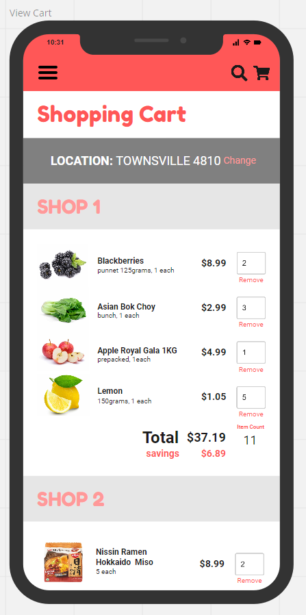
View Cart Section
- The Shopping Cart Section shows you an overview of all the items you have selected.
- It categorises your cart into various shops so you have a clear picture of how many shops you will need to visit to get all your items.
- It shows you your quantity per item as well as the total price per item.
- It shows you the total amount you will need to spend at each shop as well as the amount you will have saved at each shop.
- The top of the screen will show you your location.
- Next to your location on the right there is a button to change your location which is set by GPS.
- To make a manual change google maps has a built-in widget and API.
-
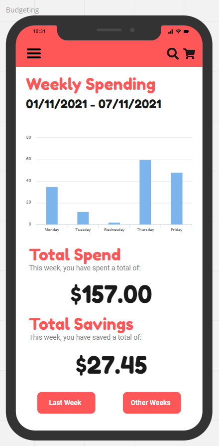
Budgeting Section
- The budgeting section of the app displays your Weekly Spending which is dynamically populated using JavaScript.
- The information on the bar graph can be made using a canvas tag, and we could draw on it using JavaScript which is also able to set heights.
- You can then see your total spend during the entire week.
- Below that you can see your Total Savings for a week.
- There is a button that can take you to the previous page to see data from the week before and there is a button that shows you other weeks in the app. The more you use the app the more data can be represented over time in the app.
-
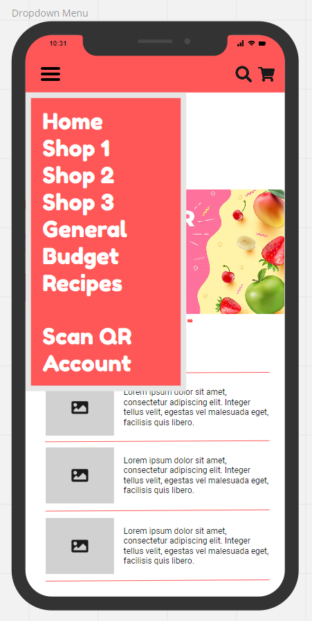
Dropdown Menu
- The hamburger menu drops down to show you a list of categories.
- In order, you can navigate to the home page, Shop 1, Shop 2, Shop 3, General, Budget, Recipes, Scan QR and Account.
- (Further design meetings have led us to the decision that the Shop 1,2,3 options should be changed to one ‘Search’ option.
- Once you have clicked the search option you can view shops in your area based off the GPS Location Data.
-
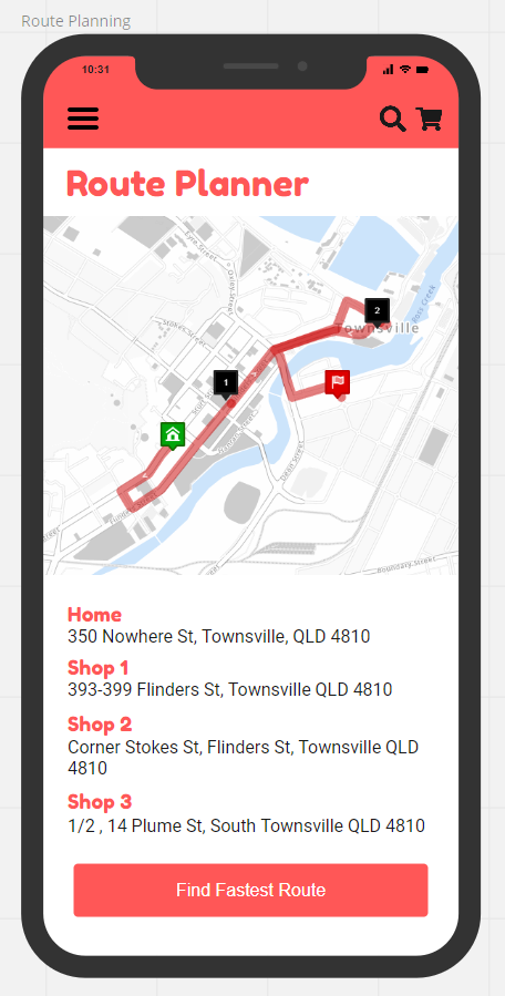
Route Planning
- Once you have selected your groceries and are ready to go shopping, you can use the apps Route Planner function.
- This will show you the route you need to take to visit the shops in your local area. The route planner, will provide you with the optimal route, taking into account predicted traffic and the location of the stores, to work out the quickest journey that the user should visit the stores in, and what route they should take.
- It will be displayed clearly on a map including your home destination.
- You will then be able to press the Find Fastest Route button, to take you straight to the Google Maps function and start your journey.
-
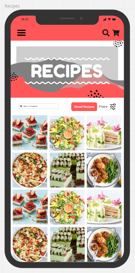
Recipes Selection Section
- This section of the app allows you to view and choose from hundreds of recipes that are stored in a cloud database such as Google, AWS or Azure. For our project we have decided to go with AWS as they are a reliable unix based system.
- There is a search function where you can search for specific recipes.
- Recipes can also be saved for later use.
- There is a filter option which will present you with input fields with drop down menus with selections to choose from. An example of this would be to filter the search to look for only vegetarian recipes, or to look for only dessert recipes.
- There will also be featured recipes section where shops would be able to have their recipes in the app as a paid promotion. Shops would be able to include recipes specific to their stores stock and this would encourage users to shop for items that they have specifically at their store when creating these featured recipes.
-
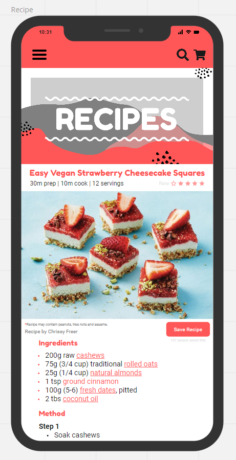
Recipes Ingredients and Cooking Instructions Section
- Once you have selected your recipe you will be taken to the individual recipe screen.
- Here you will be able to see all the ingredients needed to make your chosen recipe.
- The recipe items have clickable links to take you to the stores selling those items at the cheapest price.
- Since the recipes and ingredients are stored in a database, we can write a query on the backend using SQL. Then using SQL we can select specific products, compare specific products and also get the highest and lowest values on items.
- You are able to save the recipe as well as rate the recipes.
- The ratings will be done in house by users, and the recipes will be sources by staff from all over the internet and modified to the applications format.
- The task of updating recipes can be simplified by automating the task and having a script that imports the recipes from a CSV file on bulk.
- The rating system will also be incorporated into the filter function, and you can filter recipes based upon their popularity.
-
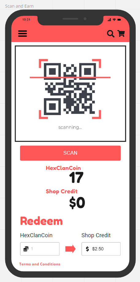
Scan and Earn using QR Code
- Users will be presented with a QR code that they can scan at local stores.
- Local stores will receive a sticker of the QR code that they can stick by the register for users to use.
- This sticker will be provided to local stores as part of the HexClan welcome pack that all shops get when signing up to the app.
- The QR code will be linked to the HexClanCoin where users can earn tokens that gives them Shop Credit.
- Alternatively, users can trade their HexClanCoin in the blockchain.
- There is a function at the bottom of the screen for users to swap HexClanCoin to Shop Credit.
-
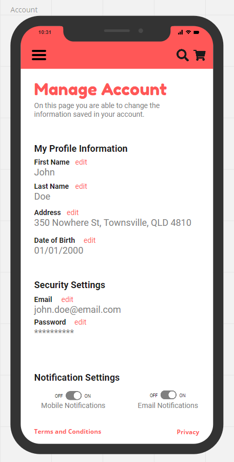
Manage account section to update and check details
- The account section is where a user can manage their personal user account.
- They can update or edit their First and Last Name.
- They can update their address which when they start typing their address will start giving suggestions of addresses that they may be meaning. They can either complete typing out their entire address, or the search bar dropdown function can be clicked when the correct address is found, and it will auto complete that section for the user.
- The user can update their address, as they type in their address a JavaScript function listening to the input calls the backend and passes in what the user has typed in. This then does a backend search through the database and returns the results to the frontend. That result is then passed to another JavaScript function that automatically populates the list. This way the user will not necessarily have to type in their entire address. They can simply click on the correct address option when it appears.
- Date of Birth can be edited and will follow the date/month/year format.
- Security Settings including being able to update your email and password.
- You are also able to switch your notifications settings on or off for both mobile and email.
Reference List
- Altvater, A 2017, What is Agile Methodology? How It Works, Best Practices, Tools, viewed 28 October 2021, < https://stackify.com/agile-methodology/ >.
- Charlebois, S 2021, Pandemic to Cause Largest Increase in Grocery Prices in Canadian History: Sylvain Charlebois, viewed 28 October 2021, < https://retail-insider.com/retail-insider/2021/08/pandemic-to-cause-largest-increase-in-grocery-prices-in-canadian-history-sylvain-charlebois/ >.
- Ferreira, N 2019, Color Psychology: How Color meanings affect your brand, viewed 3 November 2021, < https://www.oberlo.com/blog/color-psychology-color-meanings#:~:text=Marketing%20colors%20like%20red%20can%20capture%20attention.%20The,color%20psychology%2C%20red%20is%20the%20most%20intense%20color. >.
- Pahwa, A 2020, Font Psychology For Logo Design [Complete Guide], viewed 3 November 2021, < https://www.feedough.com/font-psychology-typeface-branding-logo/#:~:text=Fonts%20Help%20Building%20a%20Brand%20Personality%20Brand%20personality,right%20type%20of%20font%20for%20the%20right%20content. >.
- Poverty & Inequality, n.d., Poverty in Australia, viewed 28 October, 2021, < https://povertyandinequality.acoss.org.au/poverty/ >.
- Reiley, L & Fowers, A, 2021, Here’s why your food prices keep going up, viewed 28 October 2021, < https://www.washingtonpost.com/business/2021/09/15/food-inflation-faq/ >.